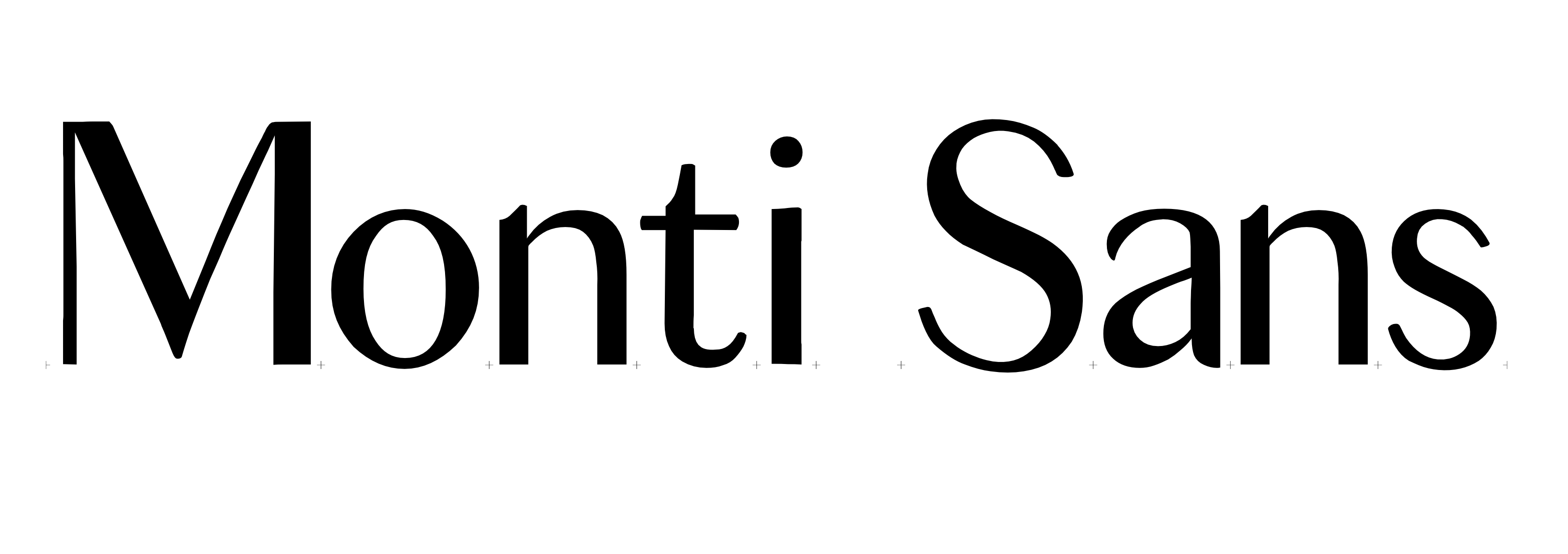
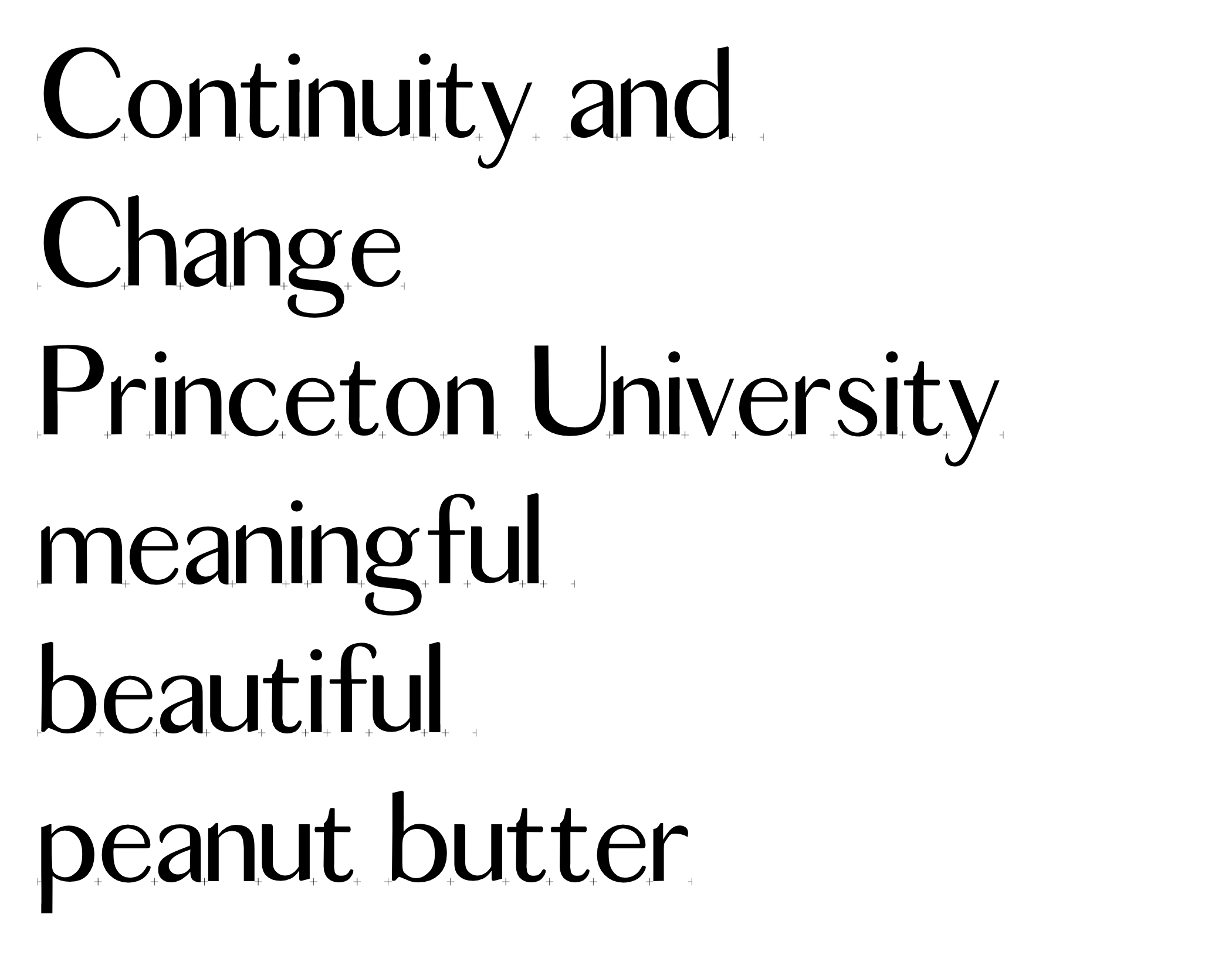
Monti Sans was developed as part of Fia Backstrom’s Art as Research class. I was interested in exploring the idea of a font as an archive; much like how photographs and documents are considered archives, I argued that fonts can also be considered archival material. This project began by researching the history of Princeton Monticello and Princeton’s identity, the results of which can be found in the booklet linked below.
The font was inspired by James Goggin’s Courier Sans, which was designed by chopping the serifs off Courier. As an introduction to font design, I wanted to do a similar exercise with Princeton Monticello, the most recent version of which was designed by Matthew Carter. In designing the font, I first printed out all the glyphs of Monticello and then used an cutting knife to remove the serifs. This allowed me to develop an understanding for how I wanted the font to exist before moving to an Illustrator and Glyphs combination.
The culmination of this work and research was an installation called Type by Association.
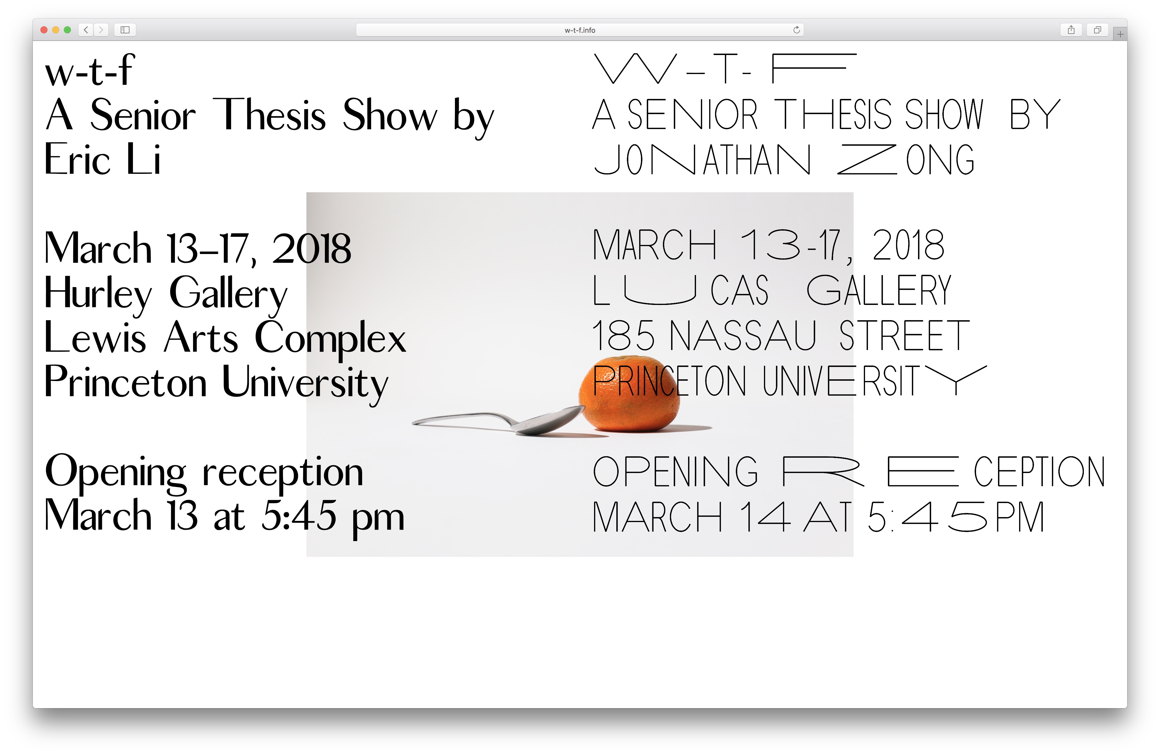
Website for w-t-f