SPAN 2016
2016
As part of my internship on the Google Material Design team, I worked with Rob Giampietro, Paul Schlacter, Damien Correll, Anthony Zukofsky, and Yiran Mao on the website for SPAN 2016, Google’s yearly conference on design and technology.
In this project, I fulfilled a variety of roles including visual research, sketching, prototyping, development, and release.
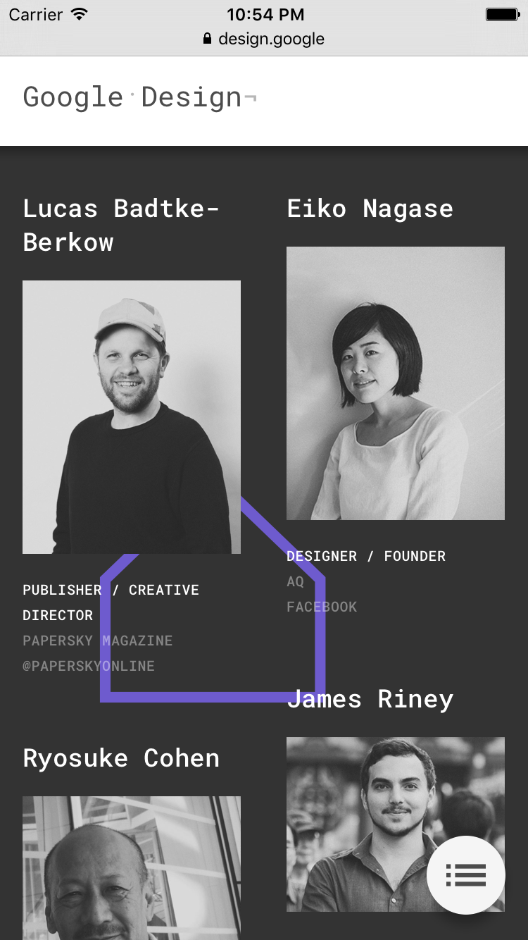
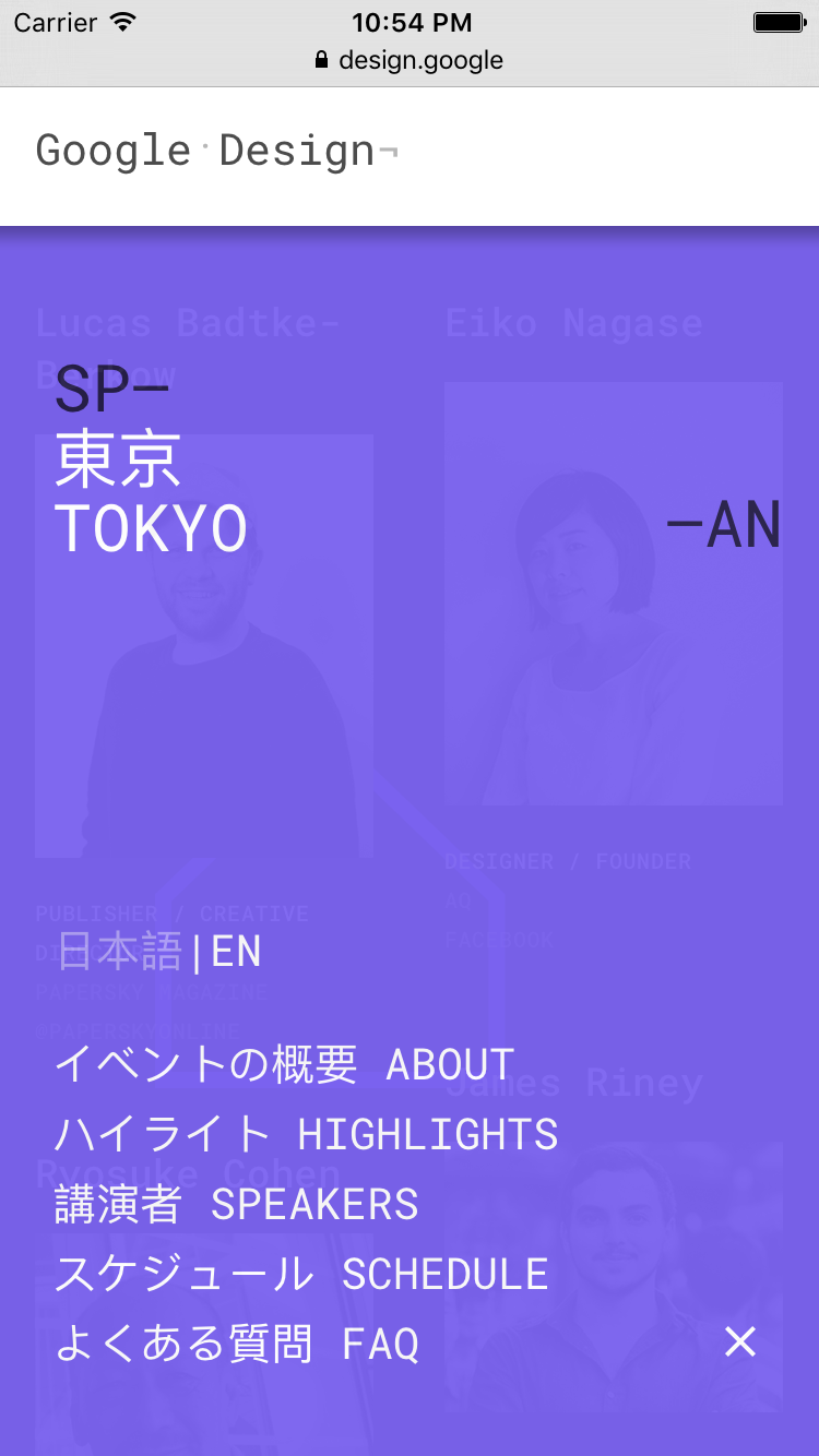
Because SPAN takes place in two locations, we had to design a website that both unified the conferences, but still gave each conference their own unique identity. To do so, we picked specific colors and shapes for each location. An added design and implementation challenge was the fact that the Tokyo site had to support Japanese as well as English.
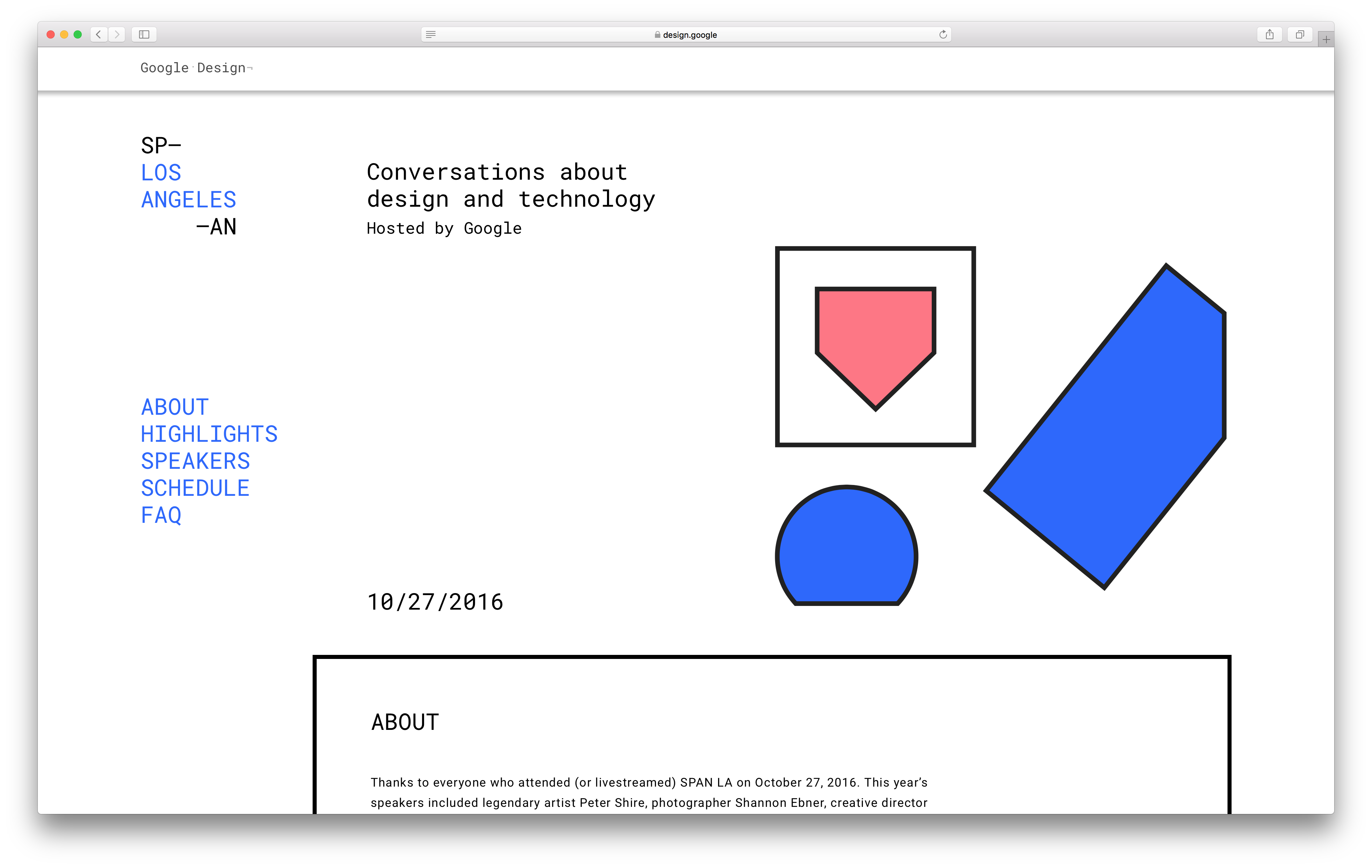
SPAN 2016 LA Landing Screen
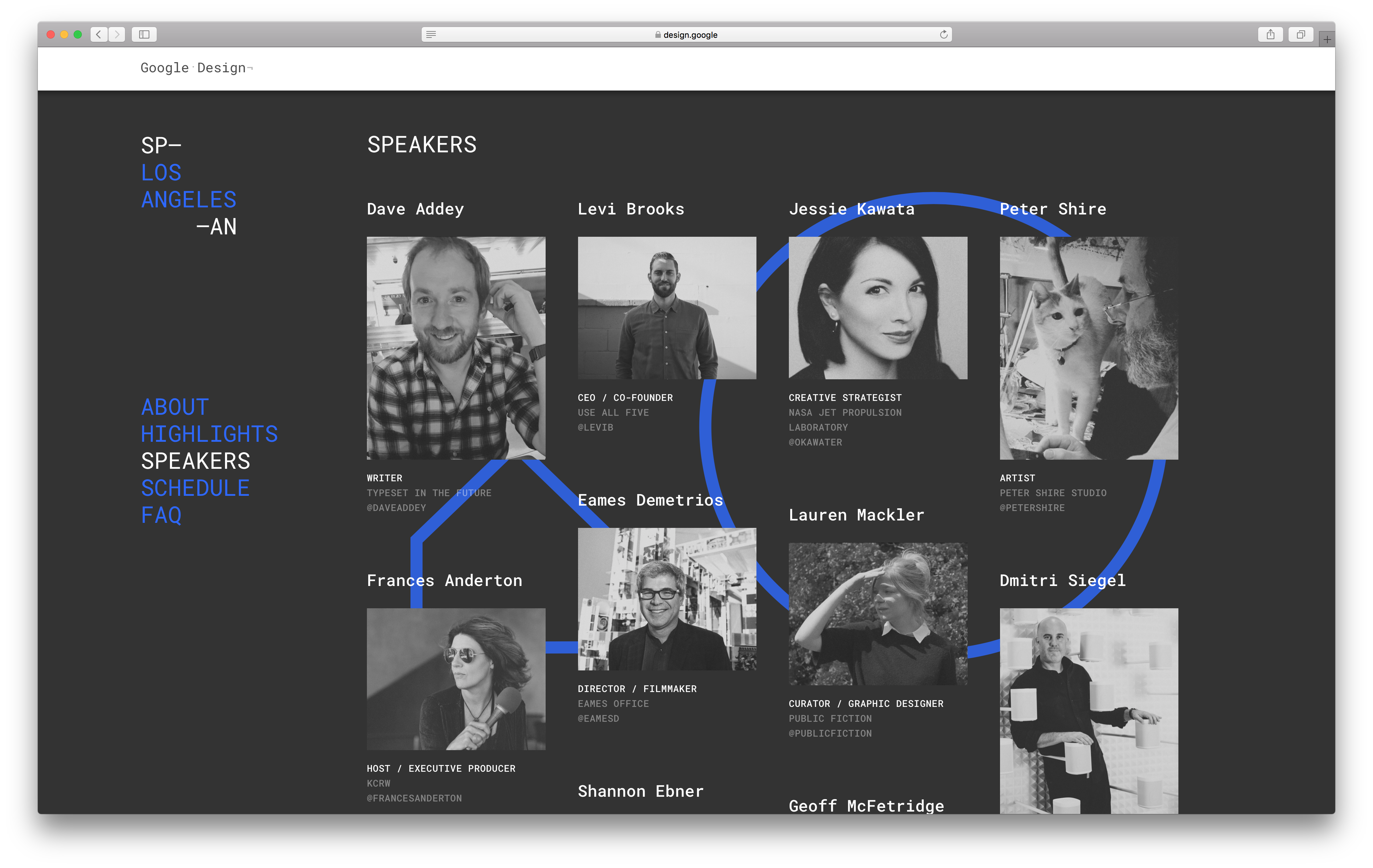
SPAN 2016 LA Speaker Profiles showcasing dynamic color palette and shape transitions.
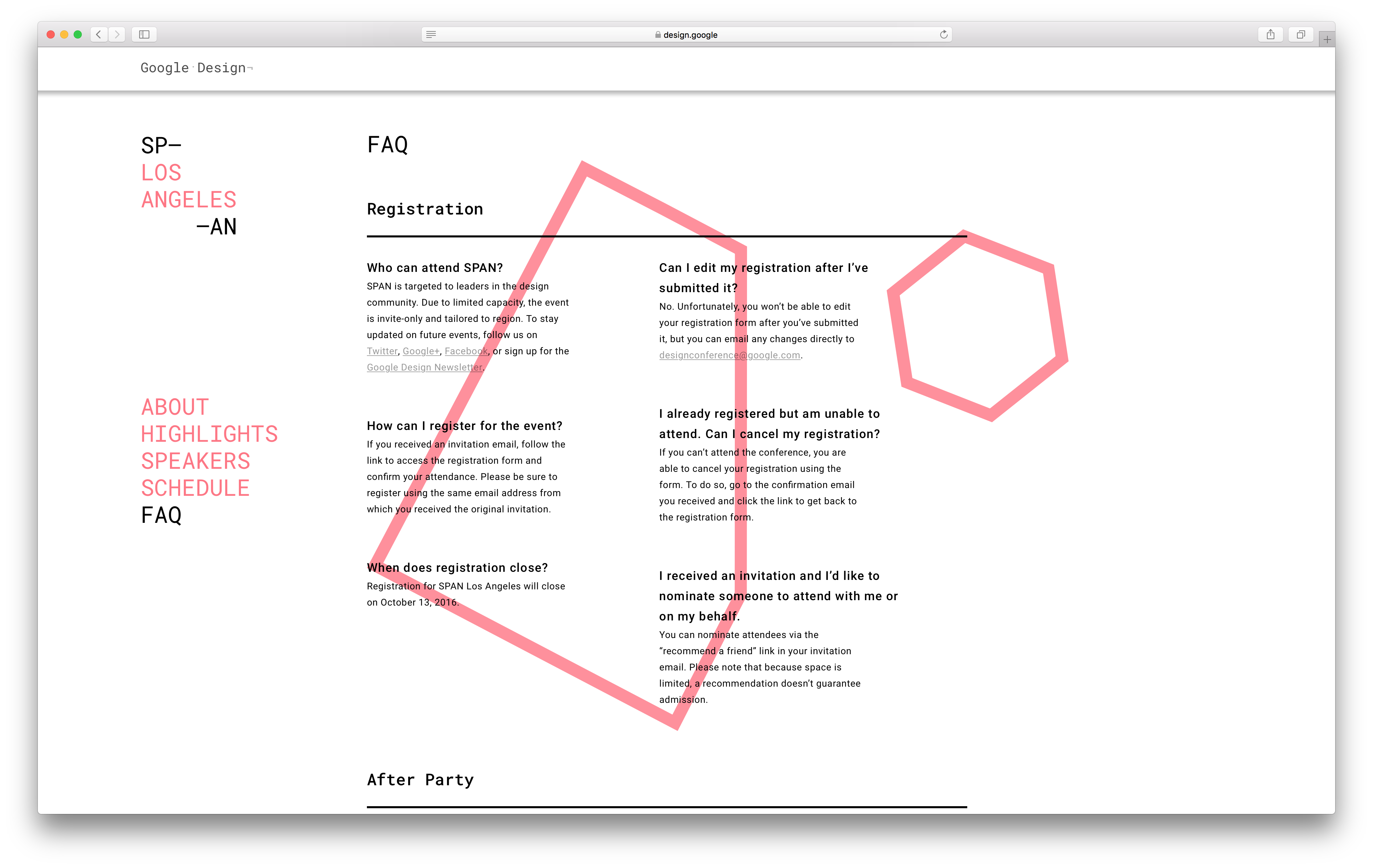
SPAN 2016 LA FAQ showcasing another color palette and shape transition.
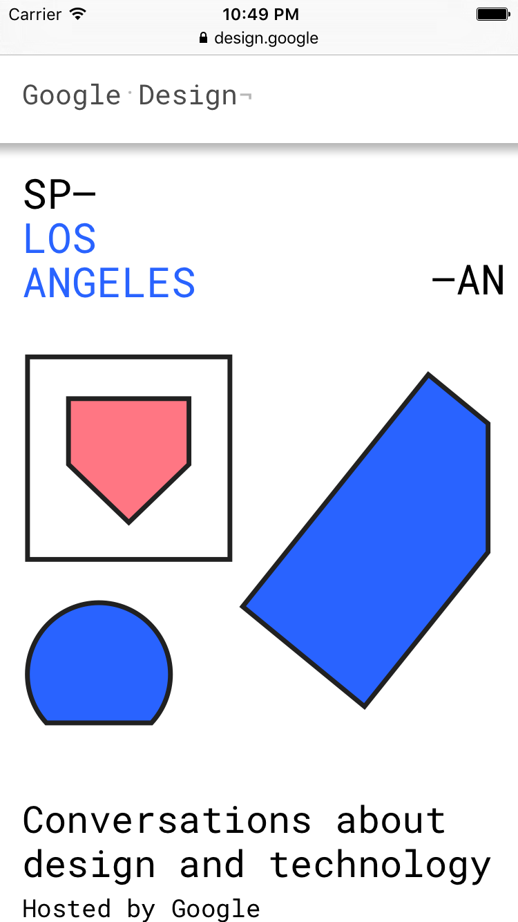
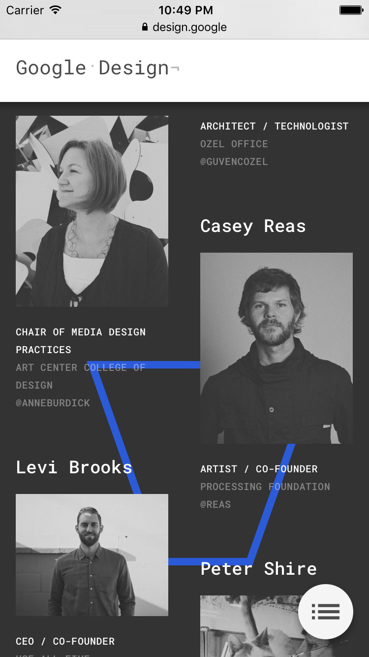
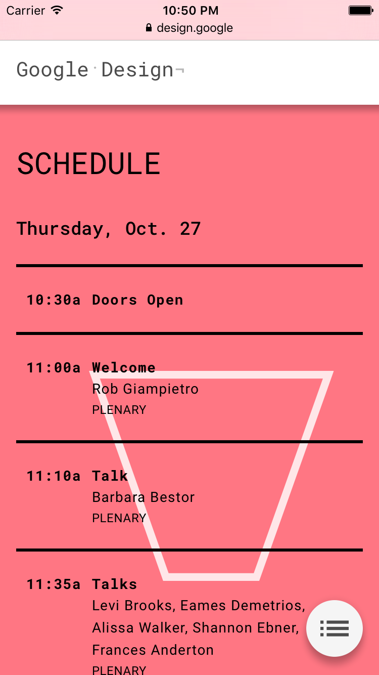
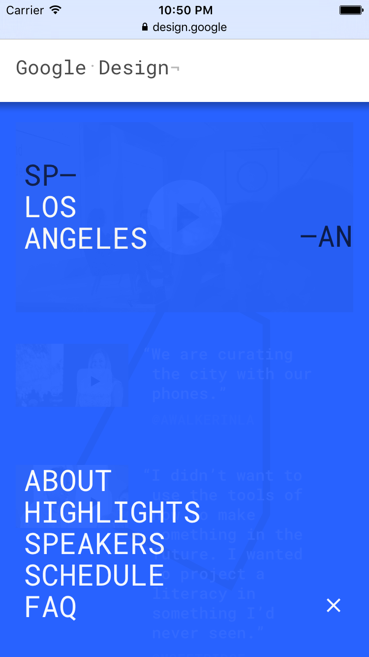
SPAN 2016 LA mobile site features.
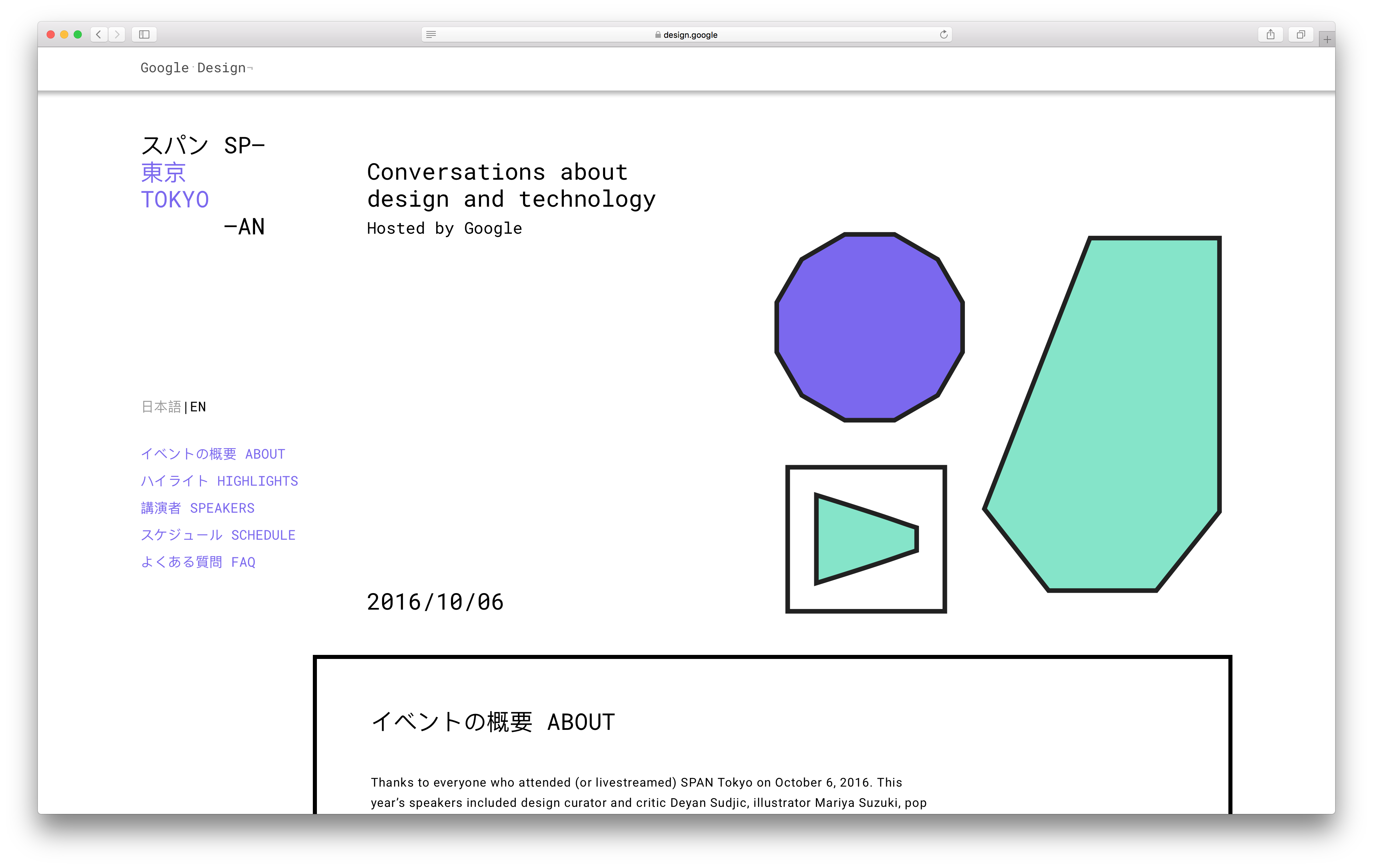
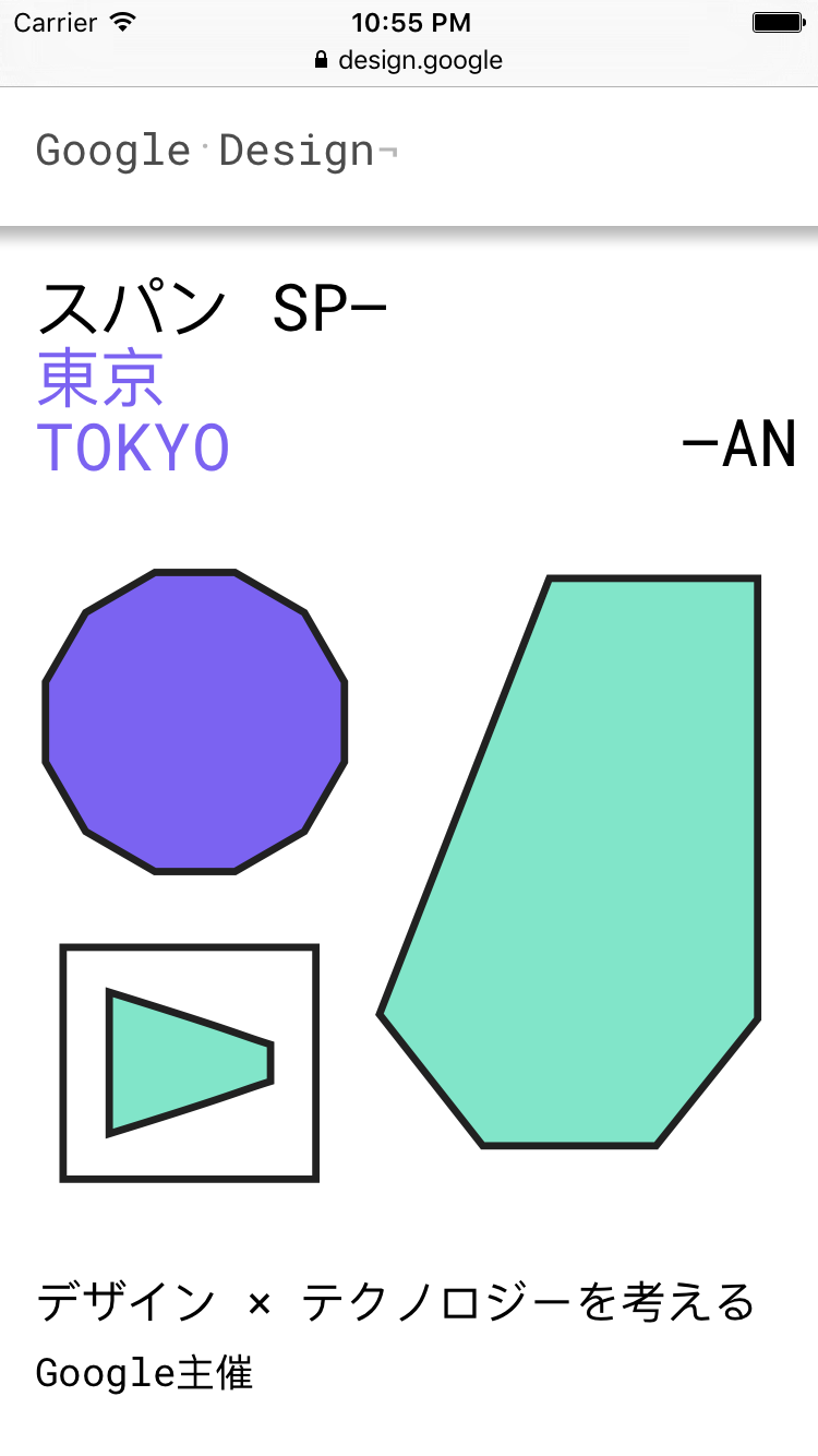
SPAN 2016 Tokyo Landing Screen featuring a different color palette than the LA site.
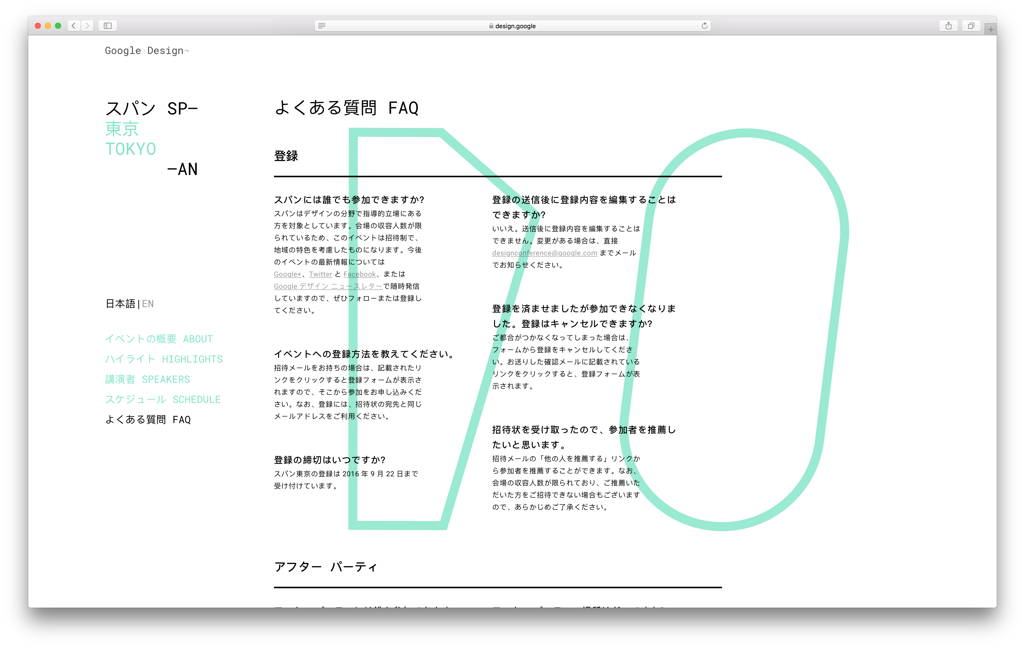
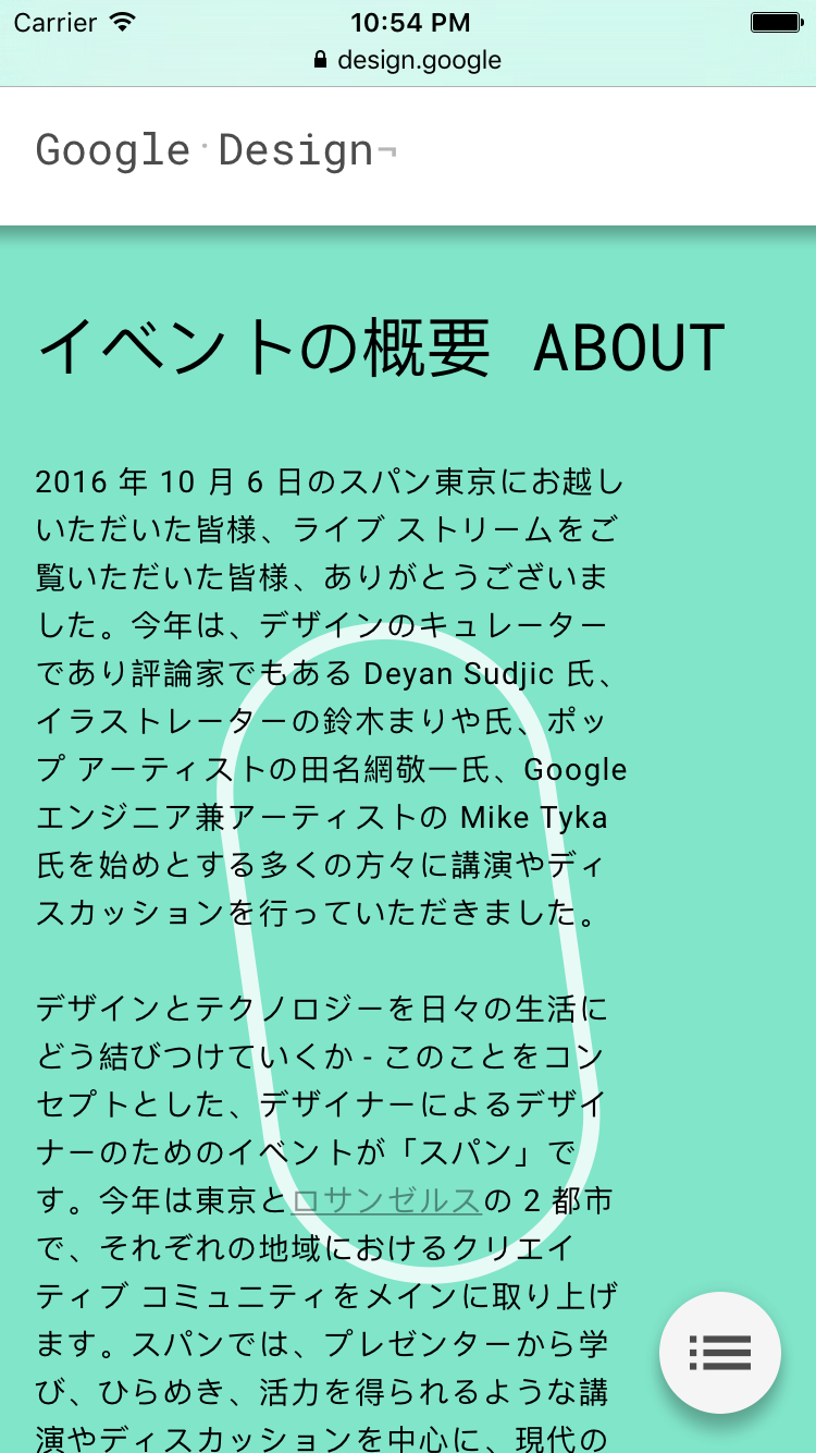
SPAN 2016 Tokyo FAQ in Japanese.
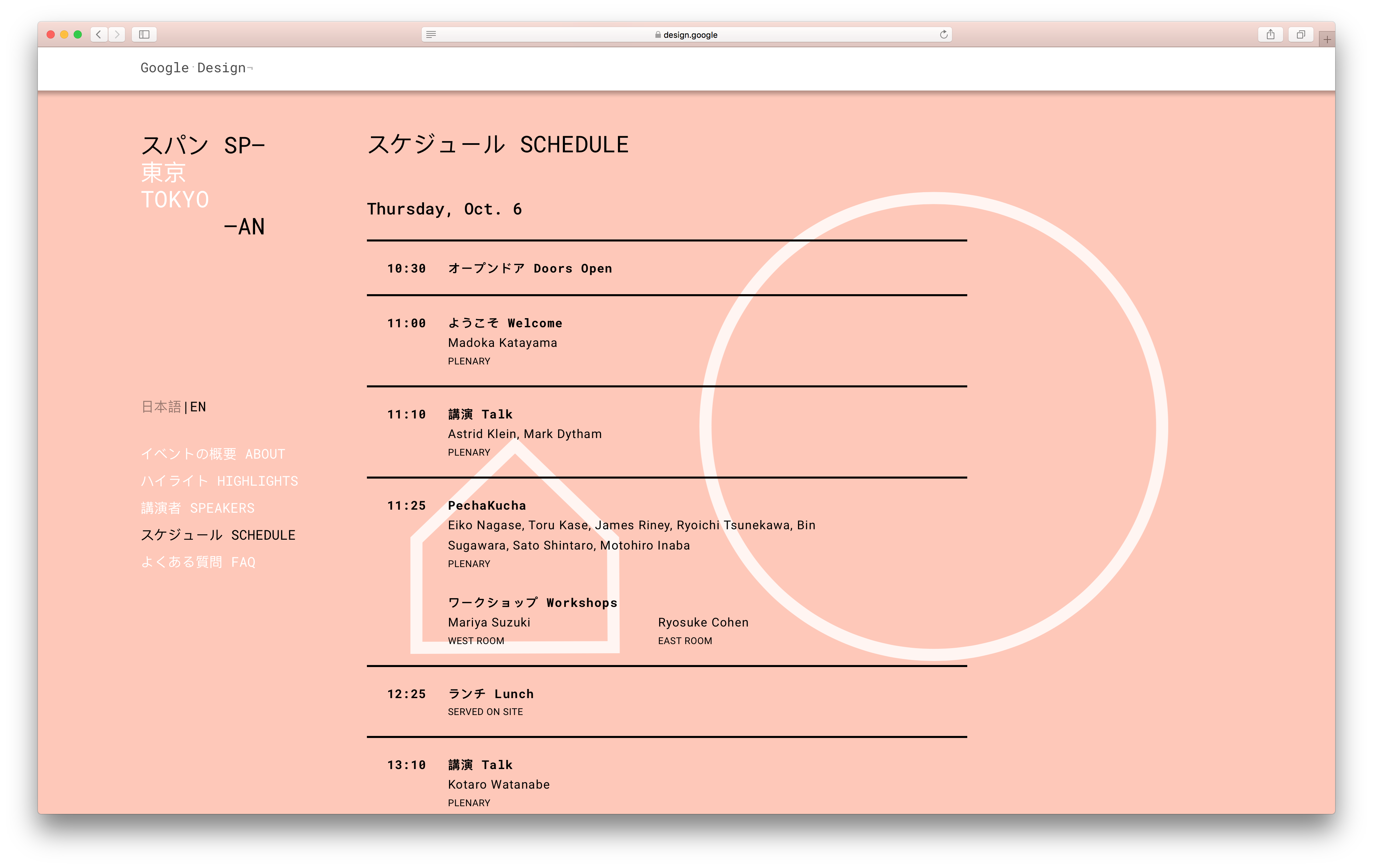
SPAN 2016 Tokyo Schedule
