During my sophomore year of college, I was appointed co-director of the Princeton Entrepreneurship Club design team. One of our first tasks was to redesign the E-Club logo.
Take One

As the founding members and later co-directors of the design team, Joe Margolies and mine’s first task was to “design a cohesive brand identity for all of E-Club and its subteams, including HackPrinceton, TigerLaunch, and TigerTrek”.
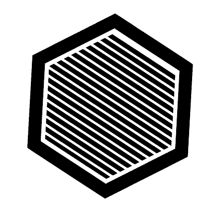
In all, E-Club had thirteen teams. When exploring ideas for a logo, we had to account for all these teams and how E-Club as a whole would be presented. We began by looking at shapes that, when tiled, would appear aesthetically pleasing. To that end, we soon settled on the hexagon - a natural building block of bee hives and more.
From here, we iterated, exploring both text and icon logos.
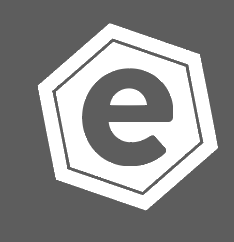
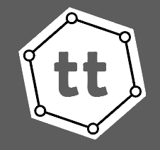
For us, it was important that each team, no matter what, have the hexagon as the defining feature; what filled the inside we would continue to iterate on. We also decided to stick with logos, with the sole exception being the E-Club overall logo. This would provide a nice contrast and also be more memorable to others.
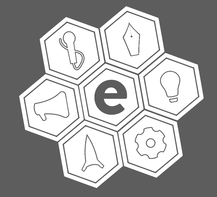
Following that, while we continued iterating on the shape, we also explored color palettes, choosing a more muted palette to represent the teams.
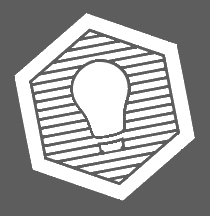
For HackPrinceton, we explored a combination of the old logo with the hexagon.
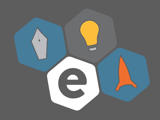
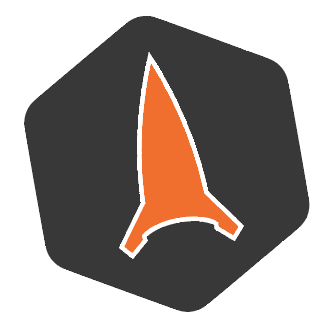
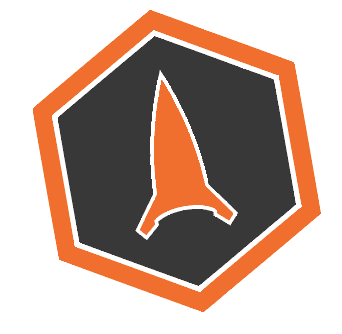
But the team that ended requiring resources the soonest was TigerLaunch, which was launching a national campaign relatively soon. In the end, we presented them with the following two logos:
However, when we presented the logos to the directors of TigerLaunch, there was an immediate backlash. To them, the logo seemed “childish” and “unprofessional.” As the team was running a pitch competition with thousands of dollars on the line, it was important for them to remain professional. as a result, our logo and overall design direction more or less stopped in its tracks. we had to reevaluate what was going on and determine what to do going forward.
Lessons Learned
Our first attempt at making an identity didn’t pan out exactly the way we had hoped. As we talked about what went wrong and what to do moving forward, we realized several key things.
- Research. Our biggest mistake was not doing enough research. We resolved to interview the directors of every single team and understand what they wanted from an identity and what specifically they wanted for their team.
- Rigidity. We realized that we were being too rigid in our attempts at making a cohesive identity. Each team had its own culture and personality, and to try to impose that, quite literally, into a hexagon was too much. We had to find a way for each team to be clearly an E-Club team, while still retaining its own uniqueness.
- Iteration. Very early on, we more or less confined ourselves to using a hexagon. Our mistake was that we didn’t iterate and explore horizontally. As a result, when we were faced with this backlash, we had to start over from scratch.
Take Two
In addition to starting over, we also brought on two more, Chloe Song and Jonathan Zong. We began by spending several weeks interviewing every director of each team in E-Club. After that, we decided to focus on developing a logo for the organization as a whole before individual team logos. That way, we could pull influence from the main logo rather than apply too much rigidity. We began by sketching out 20 independent ideas on sheets of paper. We then presented them to each other in a critique and then iterated further.


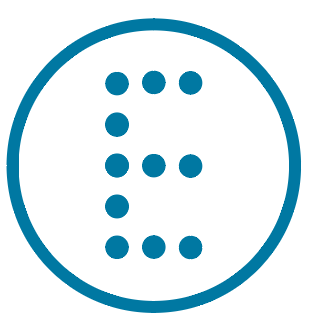
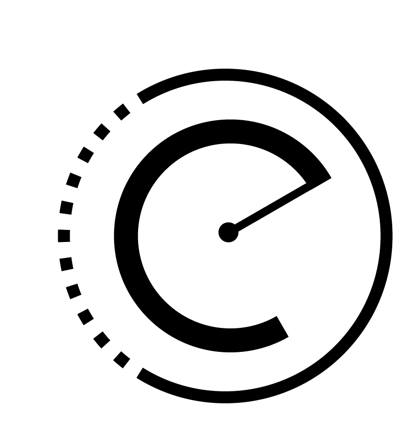
Themes that I focused on were the letters that made up E-Club. I wanted to try to see what I could do with the geometries of a lowercase c and e. From here, we iterated further on one logo. For me, that was the very last one. The presentation of the e in the center is also of note. I decided to weight the line in the e a little thinner, almost like a hyphen. In doing so, I attempted to reference the - in E-Club.
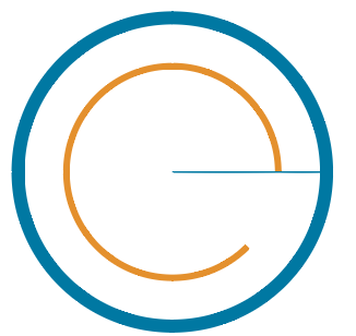
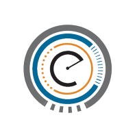
This design was interesting because of the so called orbitals around the e. To me, each orbital represented a different type of team of E-Club: intrateam, Princeton facing, and national. So i decided to refine that idea a little more to get this:
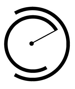
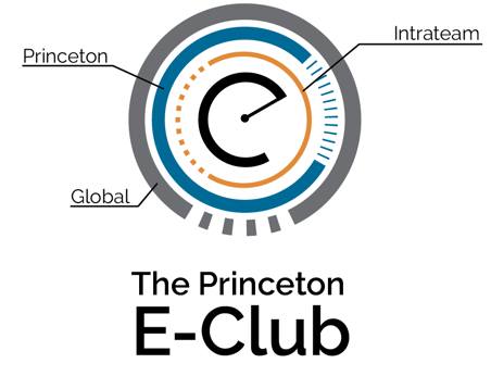
Here, each circle represented a different layer of the so called “onion.” The outermost red represented all the national teams. The blue presented Princeton facing. And the orange represented intrateam teams. At the center was the original logo that i had come up with. it was important for me to capture the multidimensionality of E-Club and all its different roles in the community. Here is the logo with some “material design” experimentation.
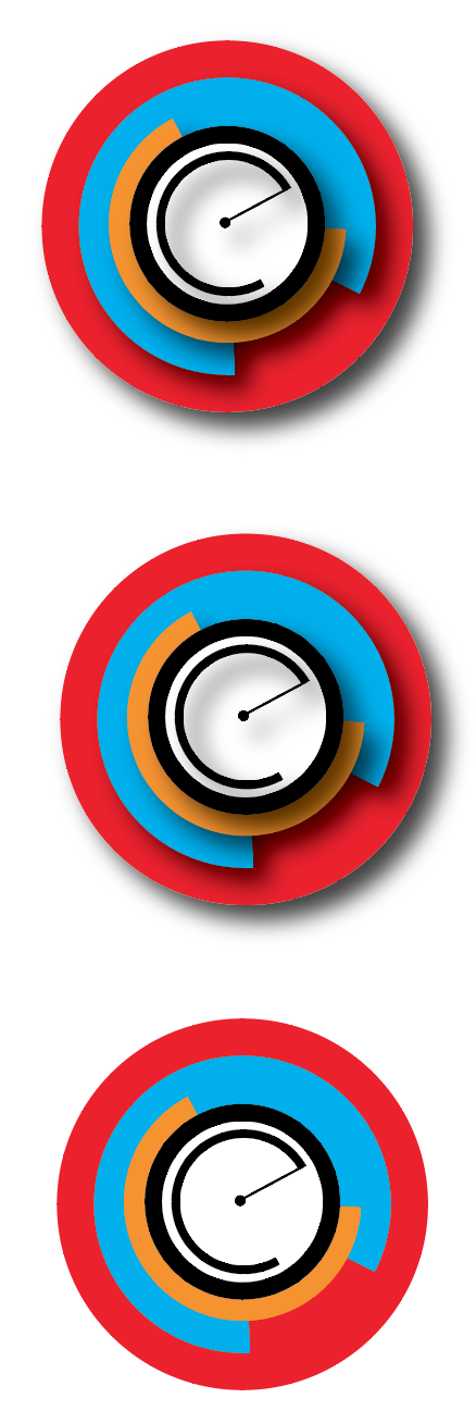
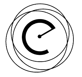
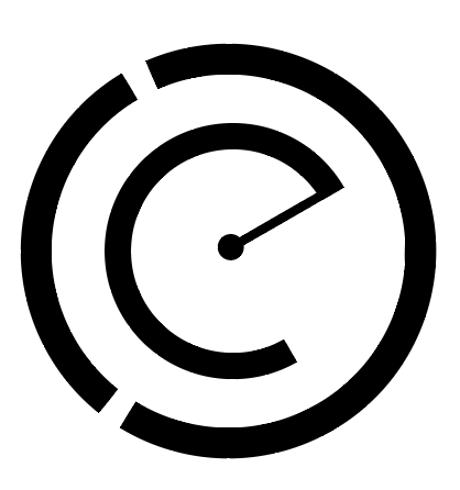
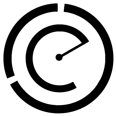
After some more experimenting, I decided to explore complete circles as another way of conveying the message, which turned out to be more effective:
I also explored some animated gifs.
What we realized after all of this was that there was too much going on in the logo. We decided to take a step back and begin to prune the excess fat. We still wanted to have a way that showed the multiple hats of E-Club while still maintaining the c. The evolution below is what led to the final e-club logo.
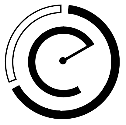
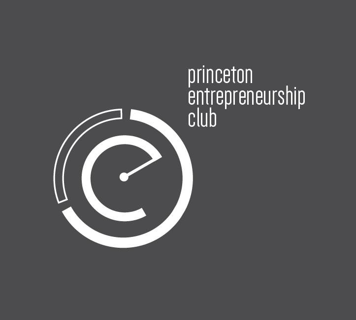
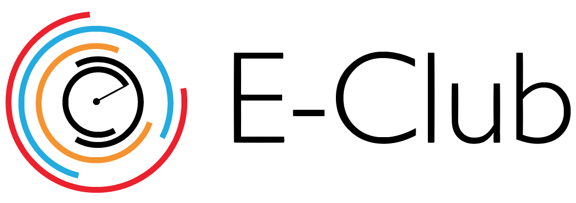
The Logo
The logo is unique because of the specific messages it conveyed. Using a circle as a base, a cut at 30 degrees and 300 degrees was made. The line was drawn at a different weight to emphasize the dash in E-Club. In particular, when combined with an outside circle, the very name of the club began to exist in the logo. Our final decision was to decide on a typeface. We ended up settling on Dense by Charles Daoud.