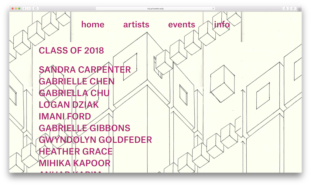
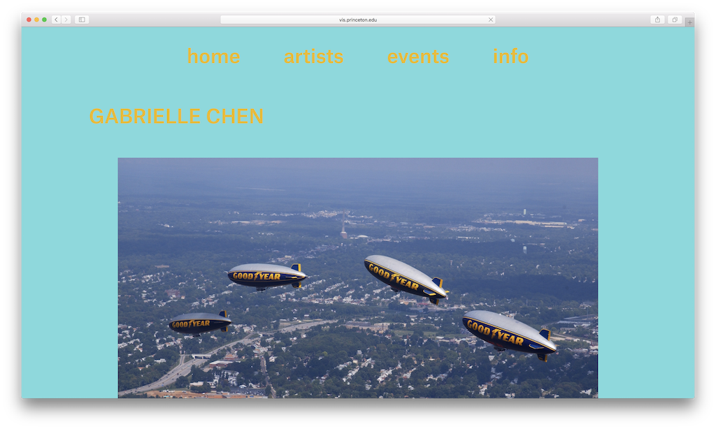
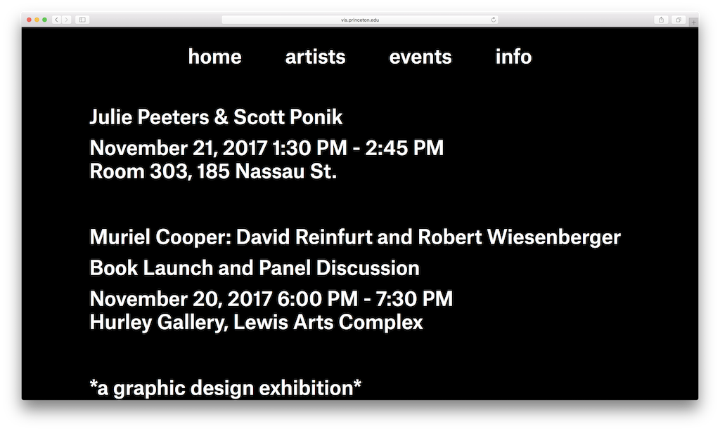
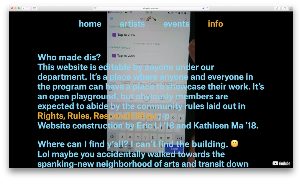
Over Summer 2017, Kathleen Ma and I collaborated on a website for the Visual Arts Program at Princeton University. We realized that for many students, there was not a good way for them to showcase their work online. In addition, we found the website for the Lewis Center to be very institutional and not at all reflective of the messiness of the program and its students. In designing the new website, we were heavily inspired by the Yale School of Art website (designed by Linked by Air) due to its extremely collaborative nature as well as the Gavin Brown’s enterprise website (designed by Geoff Han).
The website functions as a wiki. It is both heavy handed but also incredibly flexible. While we only allow one specific font (Atlas Grotesk) and are very opinionated about the layout of the artist and event pages, we also allow for all other aspects (colors and backgrounds) to be customized. This provides a good balance between allowing students to have their own voice on the website without being incredibly overwhelmed with what to do. Kathleen and I designed the website and then I developed it in Wordpress.
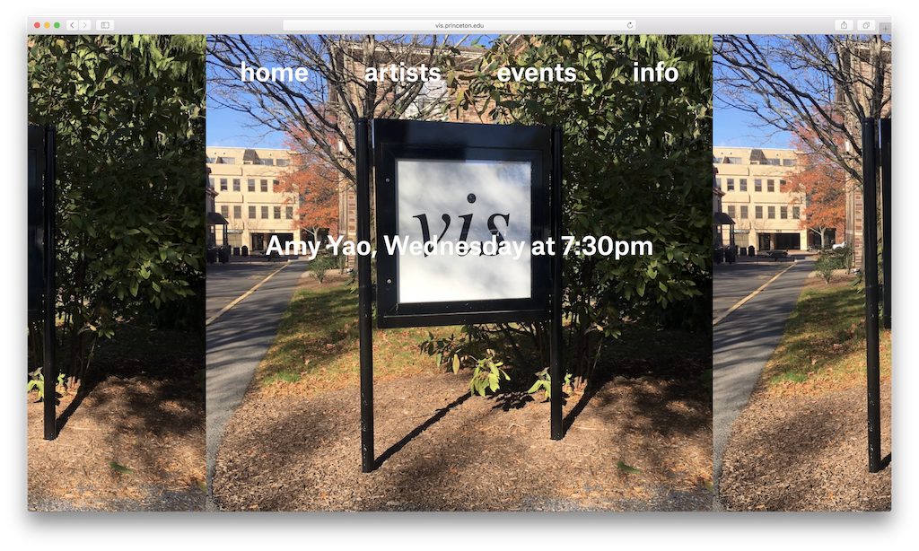
While this was going on, I also designed a logo for the program based on its institutional moniker “vis”, which is also used by the registrar to reference the program in course listings. This identity program is meant to give the Visual Arts program its own identity within the Lewis Center and coincides with 185 Nassau St. being home to only the Visual Arts Program. It is used in all printed matter relating to the department as well as placed as signage around the building.


vis logo, set in Times Italic
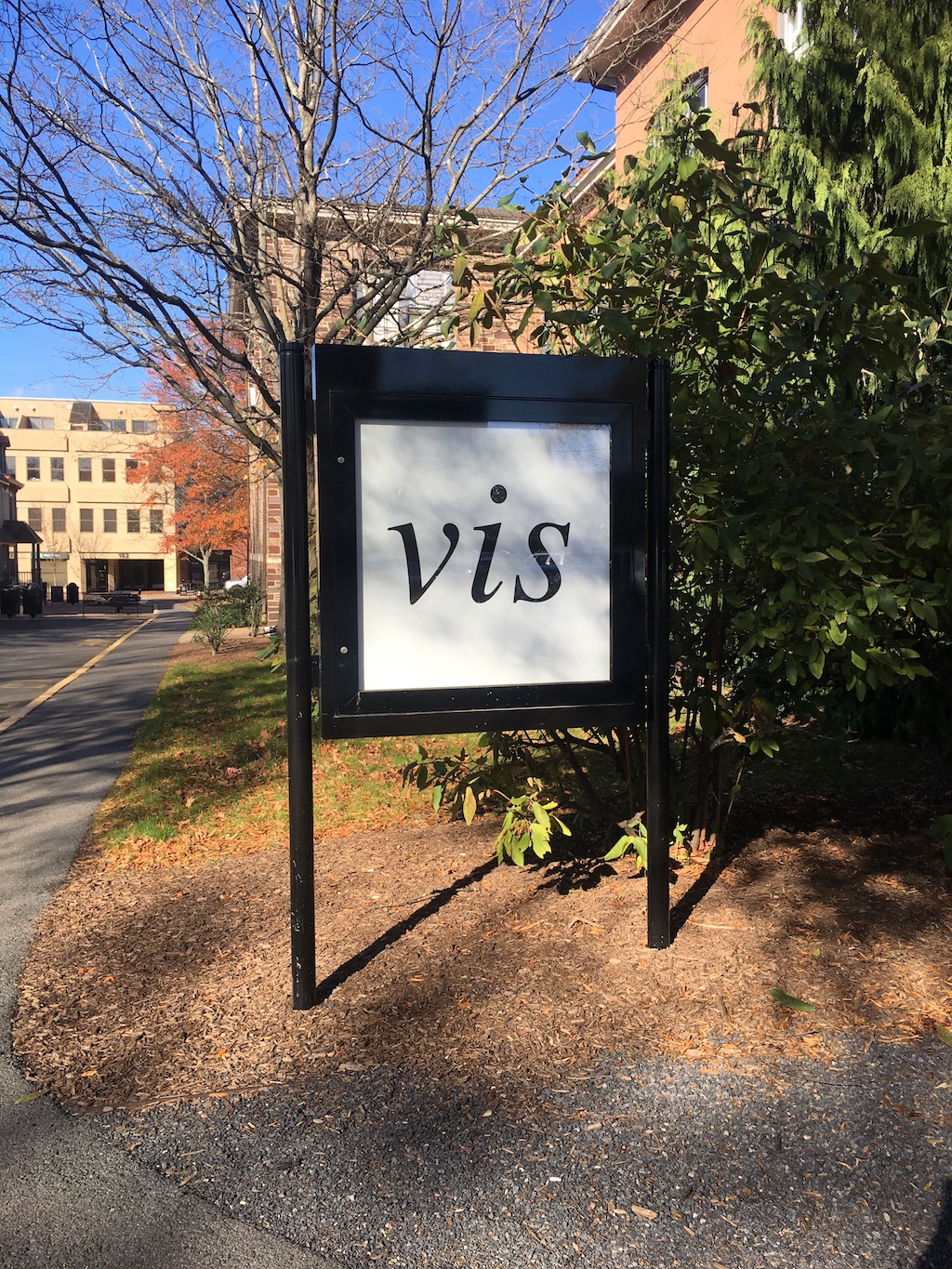
Signage outside 185 Nassau St.
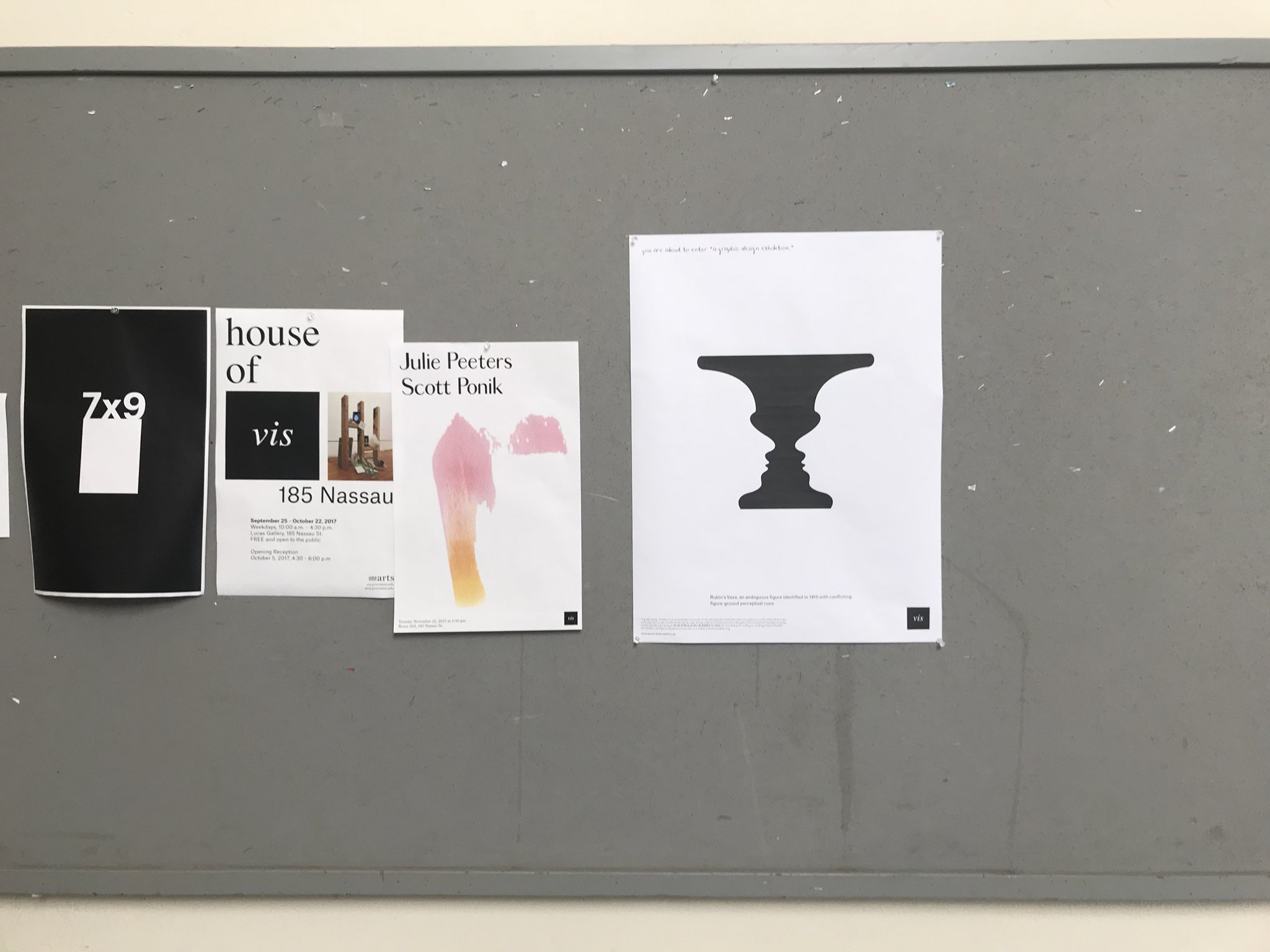
Posters using the vis identity.